
Twitter Moments for everyone
Moments team
Product design
Visual design
In 2015, Twitter launched Moments, which were media-forward stories told with Tweets. The initial product was run by an editorial team out of New York who organized the content for users.
“In other words, Moments tries to build context out of the crush of Twitter’s main timeline. If Twitter as you’ve known it so far is a rushing news wire of factoids, Moments is more like a newspaper — the statements arranged into stories, thoughtfully, artfully and in a way that’s comprehensible to the vast majority.”
- Twitter’s ‘Moments’ Will Try to Tame the Chaos, by Farhad Manjoo, The New York Times, Oct. 6, 2015
A year after initial launch, we opened up Moments creation, allowing anybody to create their own story with Tweets.
Below is an overview of the experience we designed, tested, and shipped over the course of 6 months; a collaboration of efforts between designers Cooper Smith, Tara Mann, and I.

We wanted to keep the creation experience close to the consumption experience - WYSIWYG - so we designed the maker to look similar to viewing a moment, but with empty states.
There were four ways to add Tweets to your moment: likes, by Twitter account, search, and direct links to Tweets. These were organized into a single toolbar for clarity and ease of use.

Tweets render differently in Moments, so we felt keeping the creation experience similar to the consumption experience was important - WYSIWYG.
There were four ways to add Tweets to your moment: Your Tweet likes, by Twitter account, search, and direct links to Tweets. These were organized into a single toolbar for ease of use.
Moment maker also inherited user colors so it would feel personal.

Mobile experience
Due to the editorial team’s workflow and user research we ran, we felt desktop web was more suited to creating Moments than mobile (and we had much of the technical infrastructure in place already). So we launched with the desktop product first.
We designed both experiences in tandem so that they worked together cohesively. Below is an overview of the iOS experience we designed and shipped.

We designed the mobile experience to be fast and flexible - with easy re-ordering, Tweet-adding, previewing, and simple cropping.
Below is an overview of additional screens, from setting a cover photo to re-ordering Tweets in a Moment.

A gif of the Reorder, color picker, and crop experience:
A gif of the Set cover, add title, and publish experience:

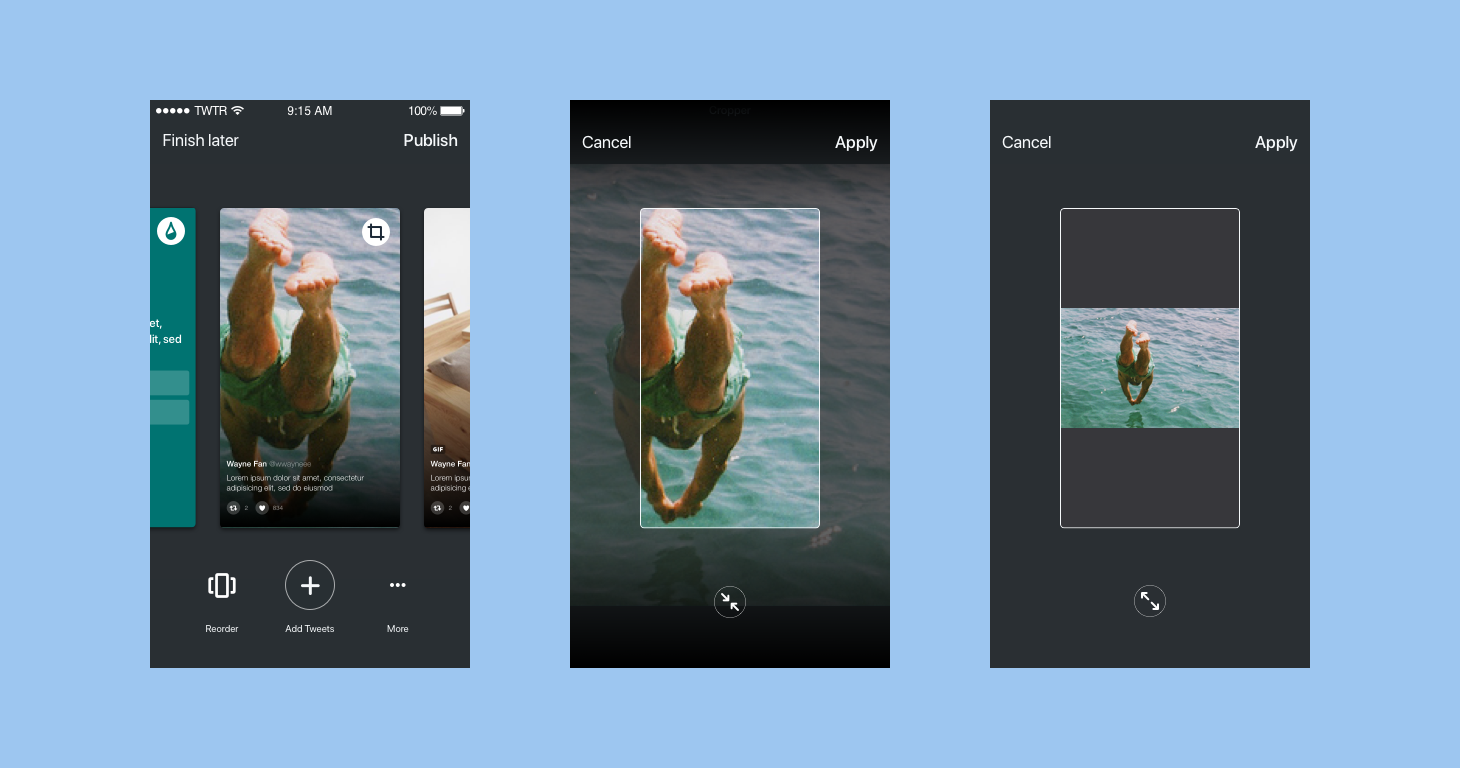
Cropping
Moments took Tweets and reformatted them so that they were media-forward. This was originally done manually by an editorial team.
One of the more complicated aspects of this project was figuring out how to provide the user with an intuitive flow to crop media Tweets for their moment. Many prototypes and a round of research later…

We launched Moment maker for desktop web September 28th, 2016 and then on mobile November 30th, a month later. It was incredible watching journalists, politicians, artists, and everyday users create an abundance of thoughtful and engaging stories.
The credit goes entirely to the Moments engineering team who worked many late nights to get this complex new feature out (shout-out to Joaquim and Israel, the two fastest android developers I’ve ever worked with). A special thanks to Marina our fearless web lead, Josh Yang our PM, and Simona our researcher.