Crew Onboarding
Growth team
Product design
Visual design
Research
We saw a number of usability issues with our onboarding experience. We employed usability research and funnel analytics to identify areas for improvement. We were able to improve conversion, increase invites sent, and profile photos uploaded during onboarding. The work below captures the full product process of research, analytics, and design over the course of a month, starting with opportunity identification:
At Crew we measure our business growth by active organizations using Crew.
How can we increase the number of active organizations?
Below is a diagram of how orgs become active:
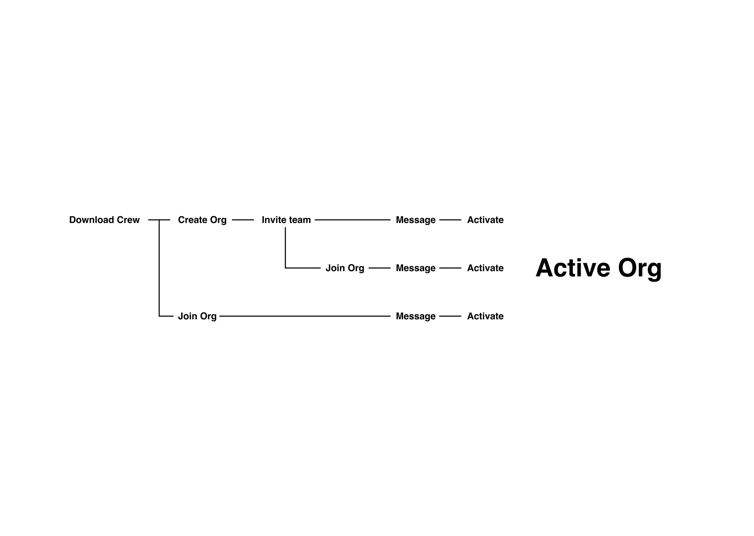
Many of these steps first occur during onboarding.

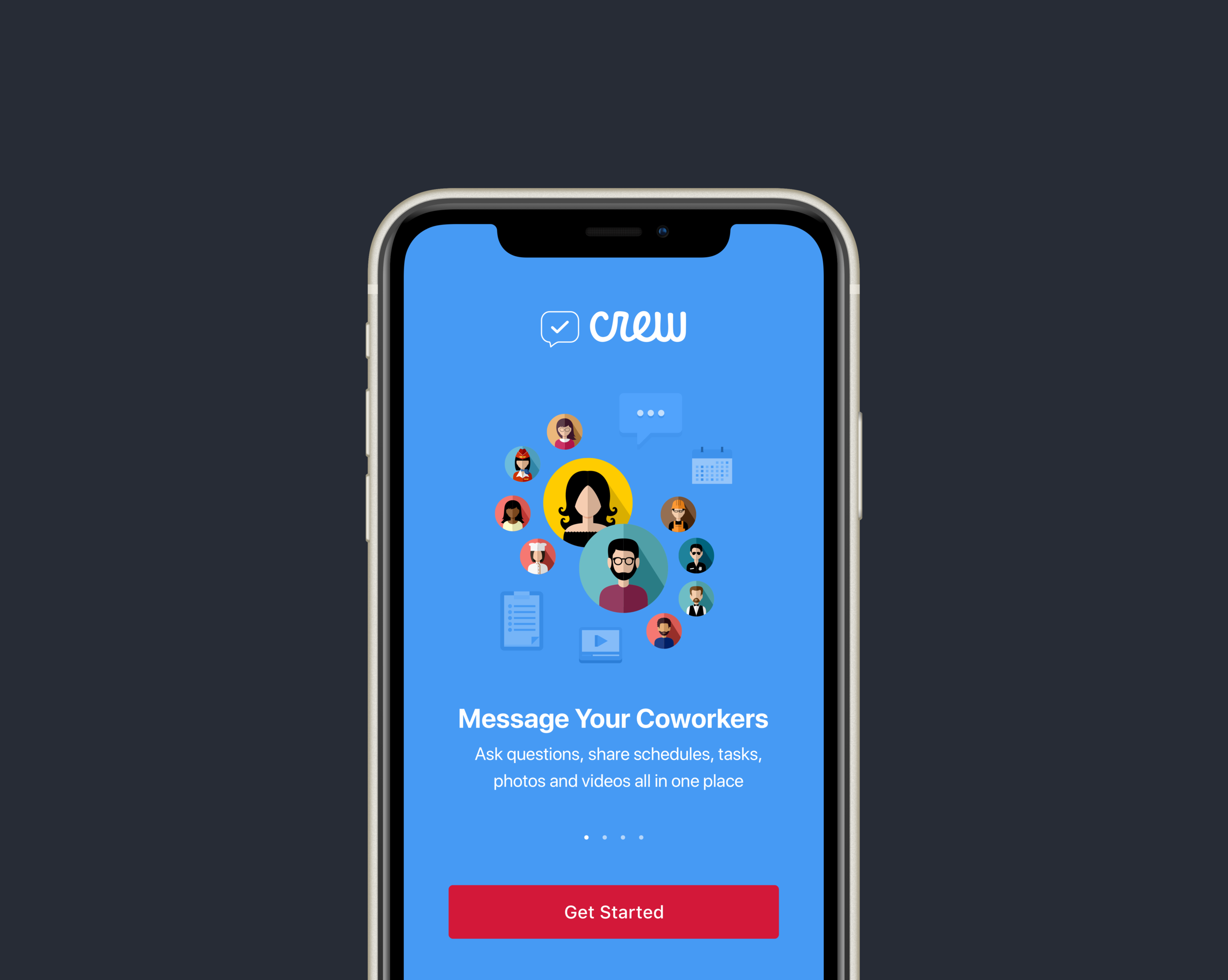
Below is an overview of what onboarding looked like:
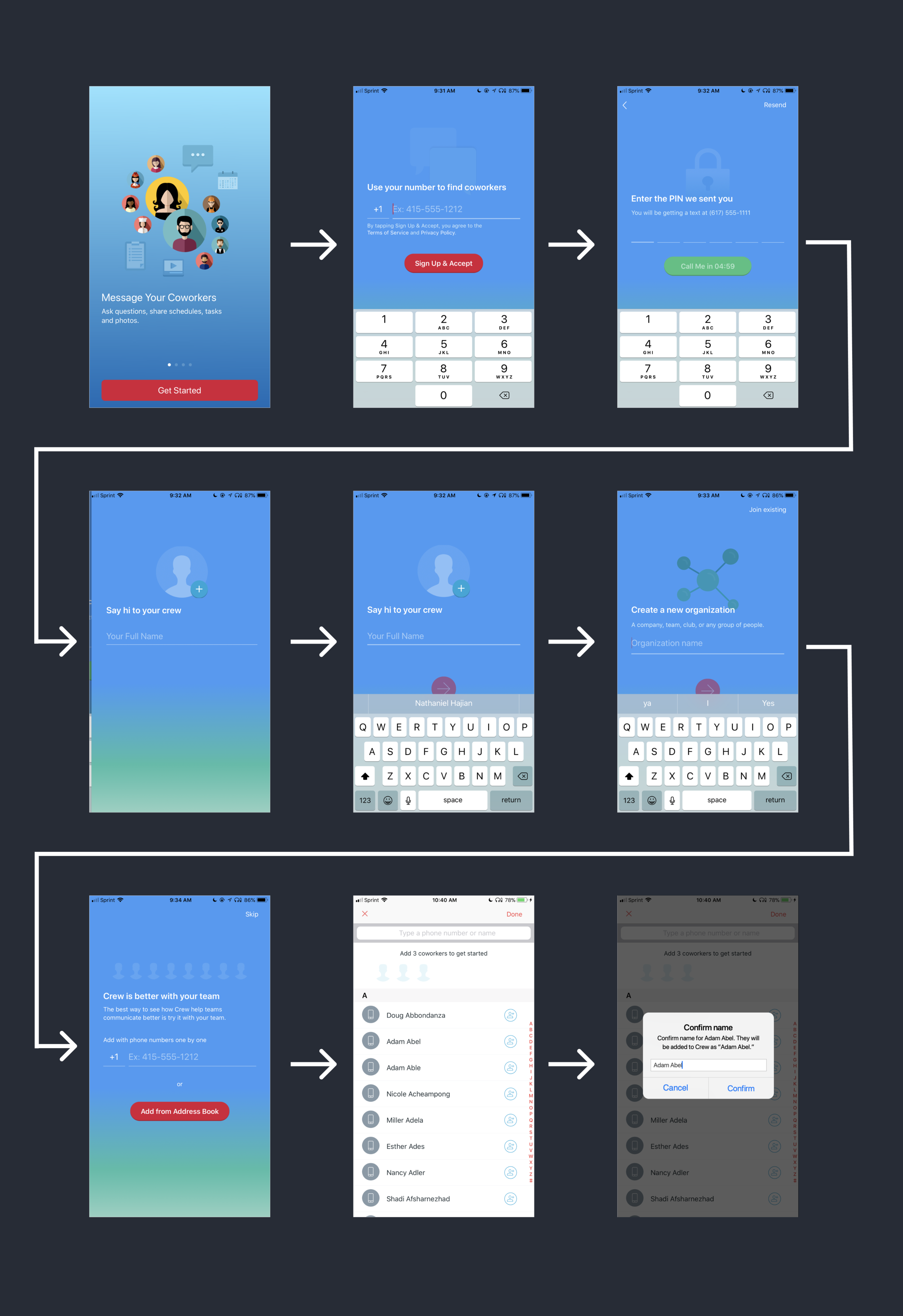
A few issues were apparent:
The profile image call to action is not clear
The keyboard can hide progress buttons, especially on smaller screen sizes
Address book inviting takes awhile because you have to confirm each person you add
To validate these issues, we put together a funnel and found:
15% of people upload a profile photo (Profile photos are correlated with user retention)
44% of people on the create org screen tap “Join existing” and see a QR code scanner, which sees less than 1% use
43% view the invite step
35% invite from address-book (10% invite via phone number)
I then ran usability research with participants who work at or manage stores like Chipotle, Macy’s, etc., who haven’t ever used Crew:
People struggled to read text on the blue background and didn’t see the profile image step
Buttons were hidden by the keyboard
There was friction in using the address-book confirmation, a research participant said, “Why can’t I just select everyone I work with and invite them in one step?”
Everyone used their address-book to add their coworkers
A clip below, of a participant using the address-book invite:
Armed with an understanding of the problem, the redesign became straightforward:
Remove friction from the address-book invite
Update the interface to be clear and legible
Visually we moved from the blue UI to an updated visual system:
A white background with black text and red buttons
Each step has one header, sub-header, and primary button
The primary call to action button moves up and down with the keyboard so it is always in view

We split the profile photo experience from the name step , so it isn’t a secondary action that is easily missed as well as added affordances and a value prop to prompt the user to upload a photo.

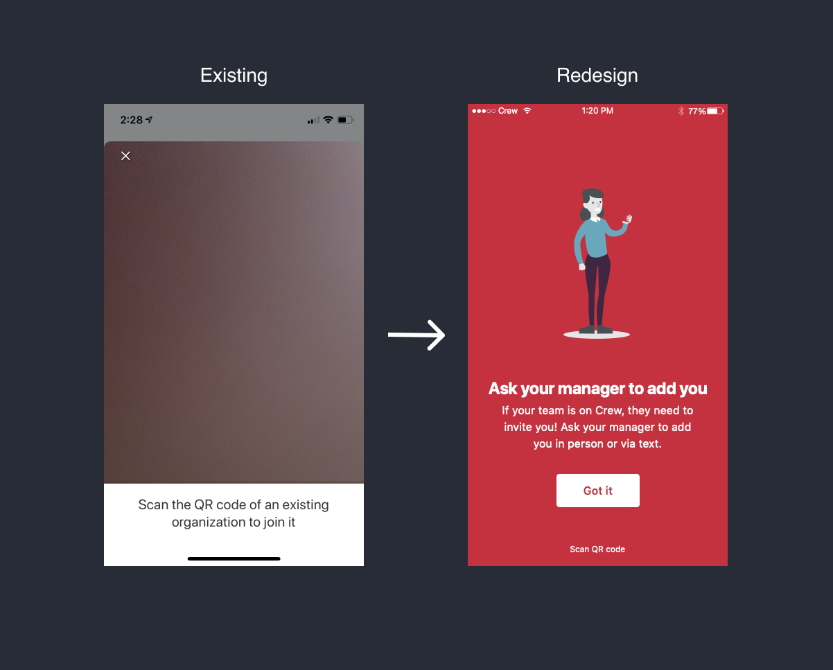
We also added education to the “Join existing” experience and moved the QR code step, which wasn’t being used, is moved to secondary action. Ideally, a user could search for their org or manager and request to join, however we didn’t support this functionality back then and it would have been a lot of scope to do so.
We streamlined the address-book invite flow by moving to checkboxes from buttons and removing the confirmation step.
We wanted to maintain the ability to change someone’s name when inviting from address-book without adding a confirmation. So we added an updating list of who you’ve invited to the UI. Tapping users in this list would allow you to edit their name or remove them.

I wanted to check if we were successful in removing friction with this flow, so I built a prototype and ran some quick research. An excerpt below:
Lastly, I cleaned up the entire UI. Below is the final product we shipped:

We launched this as an experiment and within a few weeks we were able to see meaningful results. We increased over-all invites, address-book invites sent, and our goal metric of org activations. We also increased the amount of users who add a profile photo from 10% to 60%. We didn’t tank conversion, our counter metric (this was important because we added a step, by splitting out profile image).
The project was a success and we rolled it out to 100%. As a company we continued to use this project as a case study for our ideal product process - combining data and customer insight (research) to improve our product.
Thanks to Ansel Merino for pixel-perfect engineering work and to Adam Lickel for all the product feedback along the way.